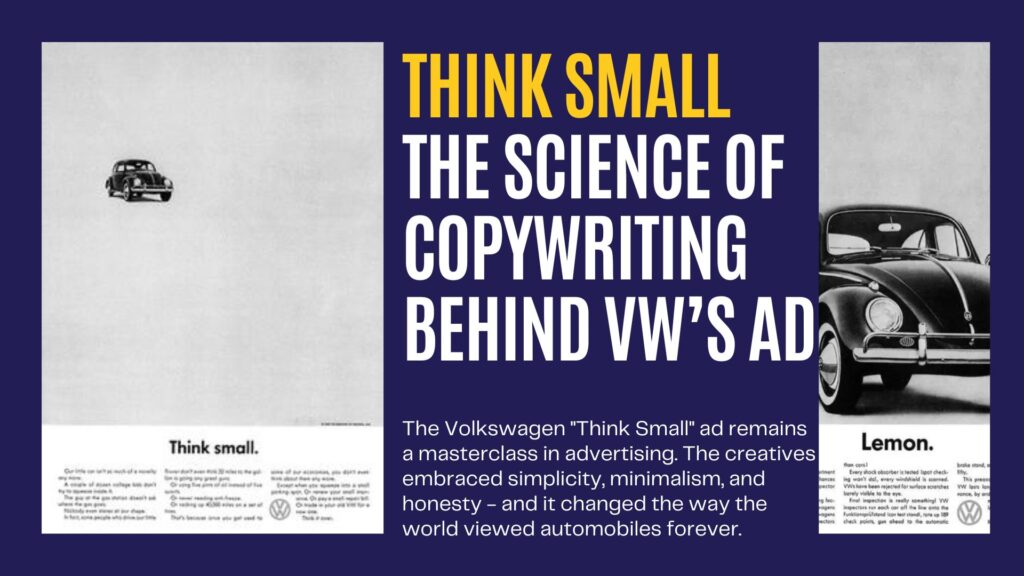
The Volkswagen “Think Small” ad is a masterclass in advertising, forever changing how brands approach copywriting and design. At a time when most ads were bombastic, colourful, and filled with overblown claims, this campaign took a radically different path, embracing simplicity, minimalism, and honesty. Let’s break down why this ad was so effective and what copywriters and creatives can learn.
1. Magnetic Headlines: The Power of Simplicity
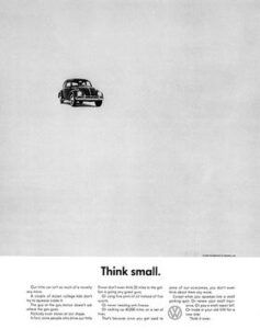 The headline “Think Small” was a perfect example of contrarian marketing. At a time when Americans were being told to “Think Big,” this ad turned that narrative on its head. It was simple and direct, immediately grabbing attention by going against the grain.
Why it worked:
- Contradiction The headline’s stark contrast to the cultural obsession with large, luxurious cars made it stand out. It made readers pause and reflect on the message, one of the core principles of great copywriting—grab attention and spark curiosity.
- Brevity Two words packed a punch in an era of long-winded claims. The lesson here? Less is often more. When your message is concise and clear, it resonates faster and more deeply with audiences.
2. White Space: The Science of Visual Silence
One of the most striking elements of the Think Small ad was its use of white space. In the cluttered landscape of advertisements, filled with flashy colors and crowded visuals, the Volkswagen ad stood out by doing almost nothing. The majority of the ad was empty, save for a small image of the Beetle and some sparse text.
Why it worked:
- Focus: The white space directs the reader’s eye immediately to the small car, reinforcing the message of simplicity and minimalism.
- Contrast: Against the backdrop of loud, colorful ads, this black-and-white campaign looked like an anomaly, instantly grabbing attention. White space in copywriting and design is crucial; it creates breathing room and allows your core message to shine.

3. Compelling, Honest Copy: The Power of Emotive Language
The body copy was direct, realistic, and relatable. Instead of boasting about the Beetle’s size or speed, the ad embraced the car’s perceived shortcomings—its small size, minimalist design, and simplicity. The copy used emotive words like “dependable” and “affordable,” which struck a chord with consumers looking for value.
Why it worked:
- Authenticity: The ad didn’t exaggerate claims or try to outshine competitors by making unrealistic promises. Instead, it emphasized practicality, which made the brand feel trustworthy and relatable.
- Emotional Connection: By focusing on everyday language and relatable emotions, the ad connected with audiences on a personal level. Great copywriting isn’t just about selling features; it’s about creating an emotional bond with the reader.
4. The Science of Contrast: Breaking Convention
Before Think Small, most car ads were filled with boastful language and images of shiny, powerful vehicles. Volkswagen, however, decided to break all conventions. Their ads featured a small, humble car with a message that focused on practicality rather than grandeur.
Why it worked:
- Breaking the Norm: By contradicting the expectations of what a car ad should be, DDB (the agency behind the ad) made the Beetle memorable. This is a lesson in differentiation—to stand out, sometimes you need to break the rules.
- Honesty as a USP: The ad’s straightforwardness was refreshing. In a sea of extravagant claims, consumers found honesty refreshing, which helped build trust and brand loyalty.
5. Minimalist Design: The Psychology of Simplicity
The small image of the Beetle in the top corner of the ad reinforced the message of minimalism. It wasn’t just the copy that was doing the work—the layout was essential in communicating the idea of simplicity. The designers used a sans-serif font to further emphasize the minimalist approach, as well as ensuring the ad had a clean, uncluttered feel.
Why it worked:
- Cognitive Ease: Studies show that people find simple designs easier to process and more enjoyable to interact with. By using minimalist design, the ad made it easy for consumers to quickly understand and remember the message.
- Perception of Value: The understated design gave the impression that Volkswagen wasn’t trying too hard to sell, which ironically increased the perceived value of the product.
The Science of Content Marketing: A Blueprint for Creatives
The Think Small campaign wasn’t just about selling cars—it was about creating a new way of thinking in advertising. The ad used magnetic headlines, white space, and emotive copy to grab attention, communicate value, and build trust. It showed that content marketing is a science, one that requires careful thought, strategy, and a deep understanding of human psychology.
Key Takeaways for Modern Creatives and Copywriters:
- Simplicity Sells: Whether it’s the headline or the design, don’t overcomplicate your message. Keep it short, clear, and impactful.
- Embrace White Space: White space isn’t empty—it’s powerful. Use it to draw attention to your most important elements.
- Be Honest and Relatable: Consumers value authenticity. Be upfront about your product’s strengths and weaknesses; they’ll respect you more for it.
- Create Contrast: Breaking away from industry norms or cultural trends can make your message stand out. Don’t be afraid to do the opposite of what everyone else is doing.
- Emotion Trumps Facts: While facts are important, people make decisions based on emotion. Tap into feelings that your audience can relate to, and you’ll create a deeper connection.
Roxzanne van Eyk is a content strategist, premium ghostwriter, brand builder and founder of Click Culture. The company specialises in retail, franchise and customer service brands. Follow her on Twitter, LinkedIn or join us on Facebook.